The process of how I create the images I share here on my blog, in my newsletter and on social media is something I am trying to share more of. I know seeing the process can break down ideas of something being ‘too hard’ or ‘out of reach’, and having advice and tips shared by others is exactly how I learnt the basics of shooting on manual settings and editing in Lightroom.
In this post I am going to focus on how I edit my food images in Adobe Lightroom (Desktop version), specifically how I rectify images that have been shot on an overcast day and therefore have a blue/grey hue to them.
If you don’t use Lightroom, you can still apply the tips below to the image editing software or app that you use.
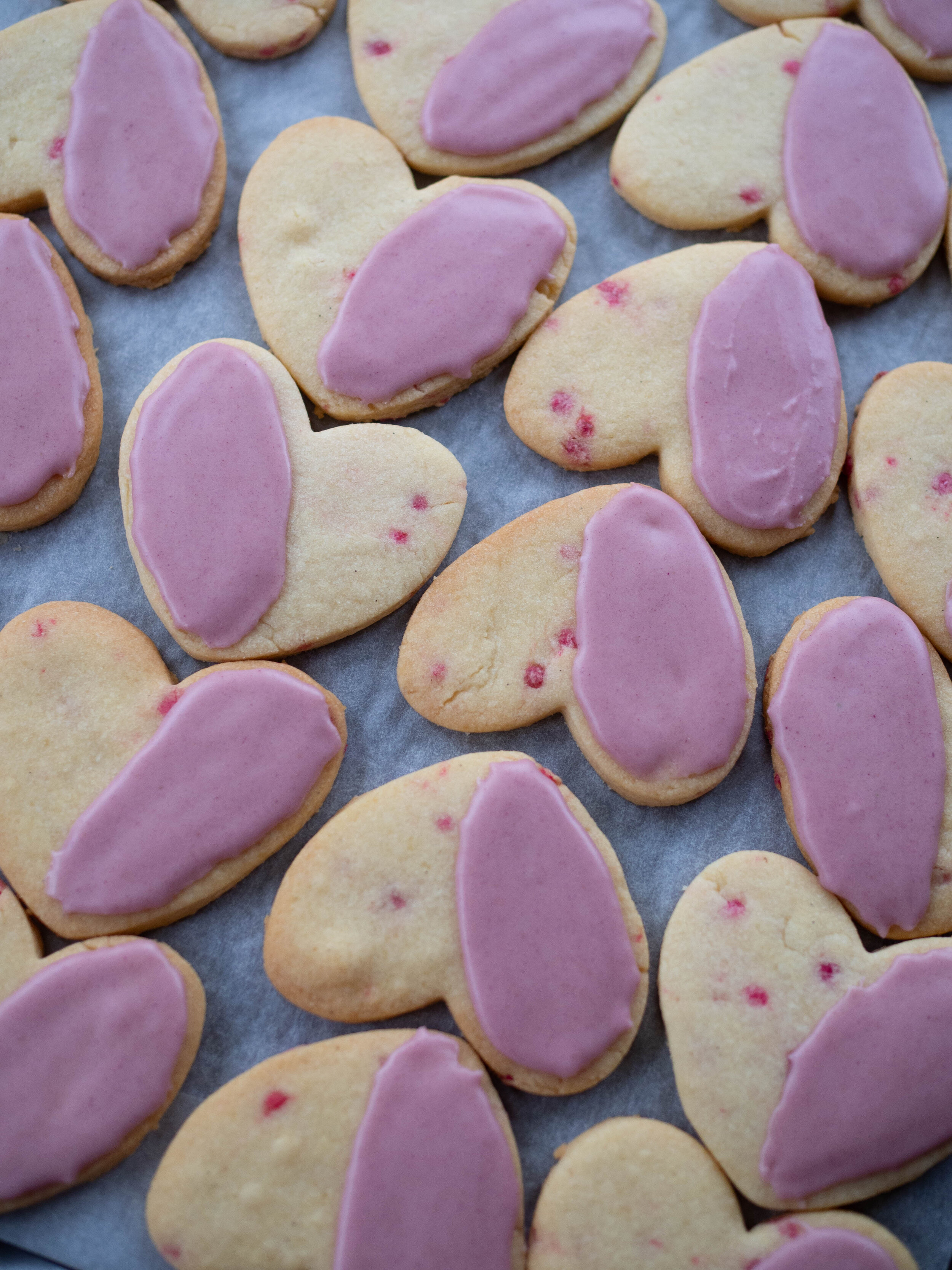
I am using an image of my Rose Sugar Cookie Hearts shot in early February, on the wettest weekend Sydney had experienced in a while!
In the tips below, I share the ways I usually edit a food image I have taken, it is not an exhaustive list and not every element will be relevant to every image. Play around with what looks best on the image you are editing, you can always undo anything you don’t like!
Click on the each Lightroom screenshot to make it bigger - I have highlighted and annotated each editing step.
For reference, the images were shot with an Olympus EM-10.
Editing Food Photos in Lightroom
Above is the image I started with. You can see how it has an overcast look to it, and needs some brightening to enhance the colour of the biscuits.
This how the ‘Develop’ section of Lightroom (Desktop) looks before you begin making any changes to the image. At the top, it will tell you what manual settings your camera was on, and why type of lens was used to shoot the selected image.
In this case I was using ISO 500, a 25mm lens, f stop 2.2 and my shutter speed was at 125. These settings are what suited my camera and my environment best at the time of the shoot, as while I was positioned right next to windows, it was later in the day and it was very overcast.
Exposure
My first point of call when editing images is adjusting the exposure if necessary. Images like this one need a bit more adjustment than others shot in better conditions. In this case I increased the exposure to +35 to brighten the image, and begin to rectify the overcast conditions the image was shot in.
Contrast
Next I check the contrast. Slightly adjusting the contrast of an image can give it more definition. Here I have increased the contrast to +12.
Shadow
I always adjust the shadow in my food images. Either to decrease the shadow, as I have in this image, or to increase it in brighter images to create more depth and texture to the image. I find when an image is already on the darker side and I am looking to brighten it up, decreasing the shadows can help.
Texture & Clarity
Similar to adjusting shadows, I also always slightly adjust the texture and clarity of my images. Both these editing options give more depth and definition to images, however for food images I would never take it past +10.
Colour Enhancement
Since this image has the pink colour that is quite dominant, I will enhance the colour a little to make it pop. Not all images need this feature, it will just depend if there is a certain colour or element you wish to highlight. To find the Colour Panel, scroll down on the right hand side whilst in Develop mode, basic the basic section we have just been working in.
Then choose whether you wish your image to have more enhancement on the hue, saturation or luminance of a particular colour. Click the round marker on the left hand side of each colour option, then hover your curser over the part of your image you wish to adjust. This will highlight which colour over on the panel best matches to the colour in your image. This is the colour you should adjust. For this image, magenta was highlighted when I hovered over the icing on the biscuits.
For this image I have focused on the hue and saturation sections in the Colour panel. I have adjusted both slightly for magenta, to enhance the colour of the icing on the biscuits but not let them look unrealistic or overdone.
Temperature
The biggest tip I can give when your shoot conditions are overcast or you have to shoot in low light and your images come out with a blue/grey hue is to alter the temperature of the image in Lightroom. I find I need to use this editing feature also when I shoot on darker backgrounds like zinc or even sometimes marble as they create can create a blue/grey tone to the image even when your shooting environment is brighter.
Simply shift the temperature gage slightly towards the yellow side, keeping an eye on the image so you can determine how far to take it. Here I’ve adjusted it from 4,550 to 5,058 and you can see the slider is still more towards the blue end than the yellow. How much you move the slider will depend on your image and what you want it to look like.
Conversely, if an image you shot is too warm looking for your style, you can use the temperature feature to cool down the tones in the image by moving the slider more towards the blue side.
Before + After Comparison
To have a look how your editing has altered the image, click on the button at the bottom of your screen to do a before and after comparison. You can also see the main changes made to the image on the Basic editing panel on the right, along with the History of changes made to the image (including when it was exported from Lightroom) on the right.
Below is the final edited image. You can see how by adjusting the exposure and temperature in particular have changed the entire image. The fact that it was shot in low light on an overcast day isn’t really noticeable now. The image now suits the fun/Summer/Valentines Day look I was going for, and highlights the lovely golden colour of the biscuits and the pink icing.


